Bengaluru One Card, The Consumer Association of Bengaluru

Homepage design concepts · Stage 1 · 10 concepts
Prepared by UIPRO Corporation for The Consumer Association of Bengaluru · 26 October 2026

Ten directions for review

Choose the face of Bengaluru One Card.

Ten photo-led homepage concepts in two rounds. Each one tells the BOC story differently. Concepts 06 and 07 are made for Gen Z, and the second round uses an entirely new set of photographs. Open each concept, try it on your phone, and tell us which direction to take forward.

Sample contentMerchants, offers, events, testimonials and card numbers are illustrative for design review. Nothing is connected to a live system yet, and forms send nothing.
Real photographyPhotos are licensed stock from Unsplash (free commercial licence), listed in assets/images/CREDITS.md. CAB's own photography can replace them later.
What we need from youPick one concept (or name the parts you like from several). We then freeze its layout, fonts and colours as the reference for the full website.

Round 1 · Concepts 01–05

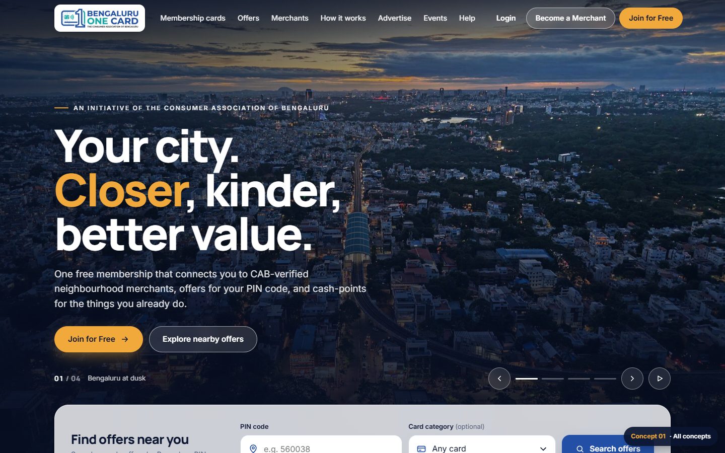
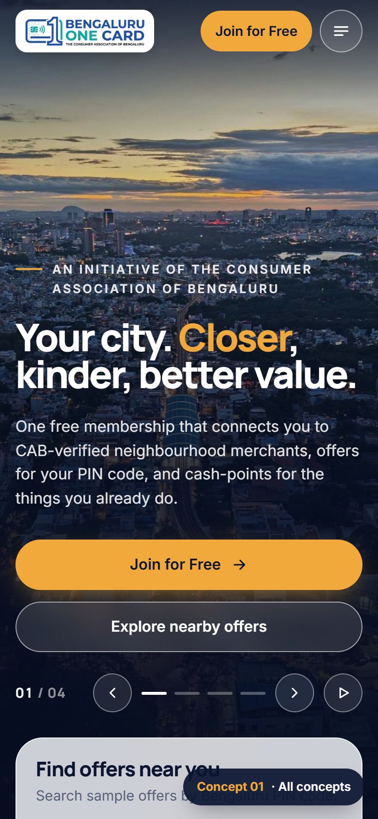
Concept 01 desktop: full-screen dusk aerial photo of Bengaluru with the headline Your city. Closer, kinder, better value.
CONCEPT 01

Cinematic City

Opens with a full-screen, slowly moving slider of Bengaluru photography and a frosted-glass PIN search over it. Then bright white sections with big photos, and a dark band where each of the seven cards floats over a photo of the person it is for.

Typography
Manrope (headings) · Inter (text)
Palette
Highlights
4-slide hero, PIN search, offer tabs, swipeable rows on mobile
Strengths
  • Biggest first impression
  • Strong Bengaluru pride
  • Search is up front
Trade-offs
  • Needs strong city photography
  • Slider content must be kept fresh
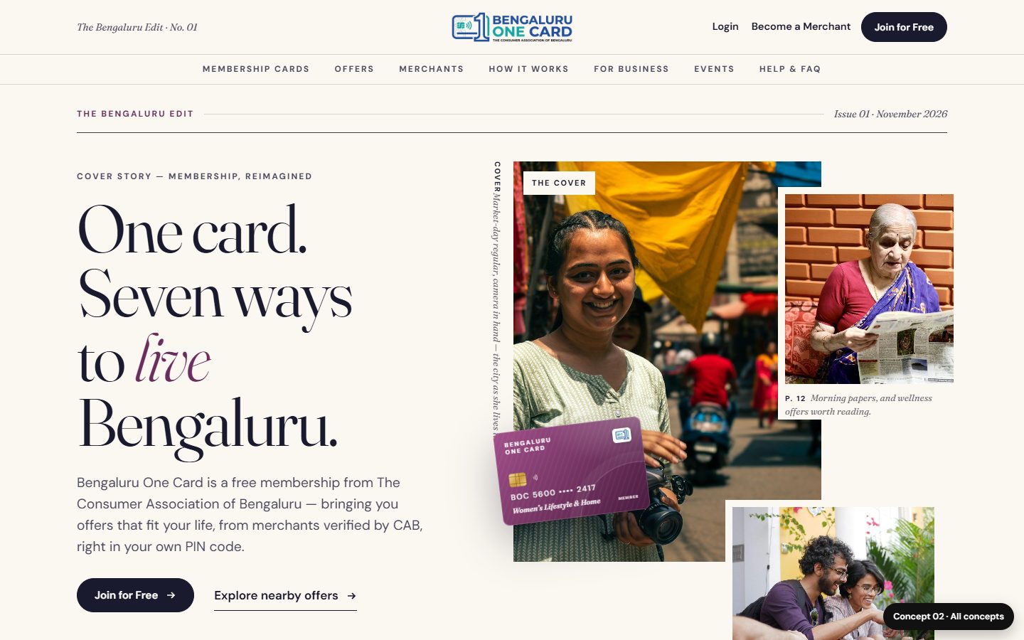
Concept 02 desktop: editorial layout with the headline One card. Seven ways to live Bengaluru. beside a photo collage and a purple card.
CONCEPT 02

Lifestyle Magazine

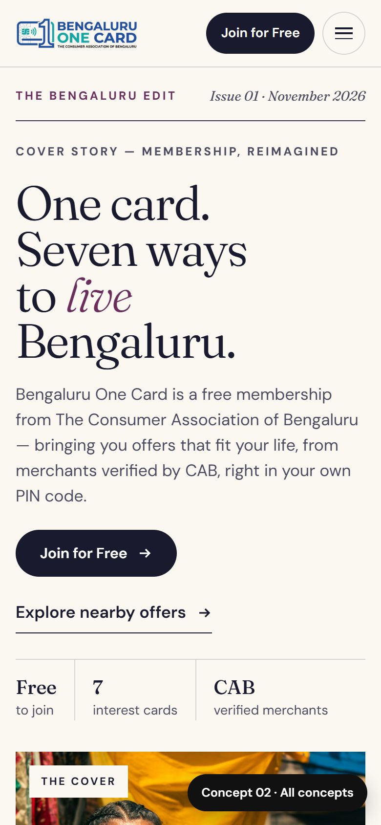
Designed like a city magazine, "The Bengaluru Edit". People photography leads. The seven cards are the cover story: pick a persona to see their photo, their card and their benefits. Pull quotes, captions and numbered stories run throughout.

Typography
Fraunces (headlines, italics) · DM Sans (text)
Palette
Highlights
Persona tabs / swipe carousel, editor's letter, stories spread
Strengths
  • Explains the seven cards best
  • Elegant and memorable
  • Feels human and local
Trade-offs
  • Longer page, more reading
  • Offers sit further down
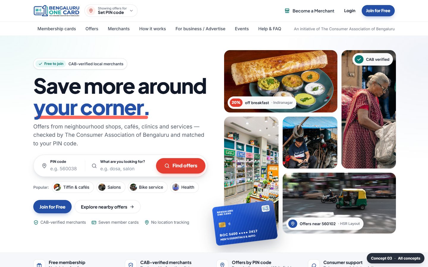
Concept 03 desktop: headline Save more around your corner with a PIN and keyword search bar beside a mosaic of food, shop and service photos.
CONCEPT 03

Local Marketplace

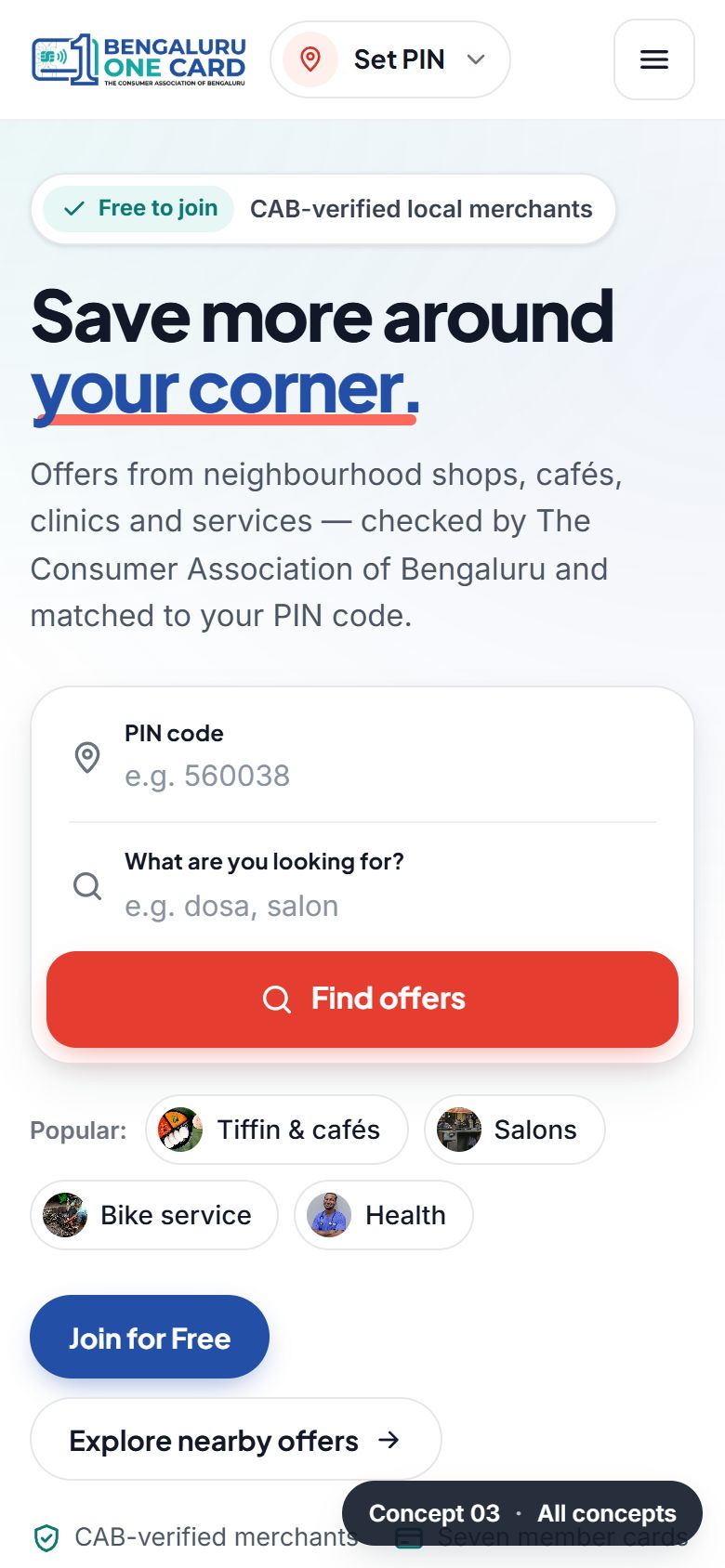
Discovery first, with the polish of a food-delivery or travel app. A search bar for PIN code and "what are you looking for", photo categories, and a feed of offer cards you can filter and save. Then verified merchant cards and a bold "grow your business" band.

Typography
Plus Jakarta Sans (headings) · Inter (text)
Palette
Highlights
PIN dialog, live offer filters, save toggle, card carousel
Strengths
  • Fastest route to offers
  • Familiar, app-like
  • Great for merchants' offers
Trade-offs
  • Less space for CAB's story
  • Needs many good offer photos at launch
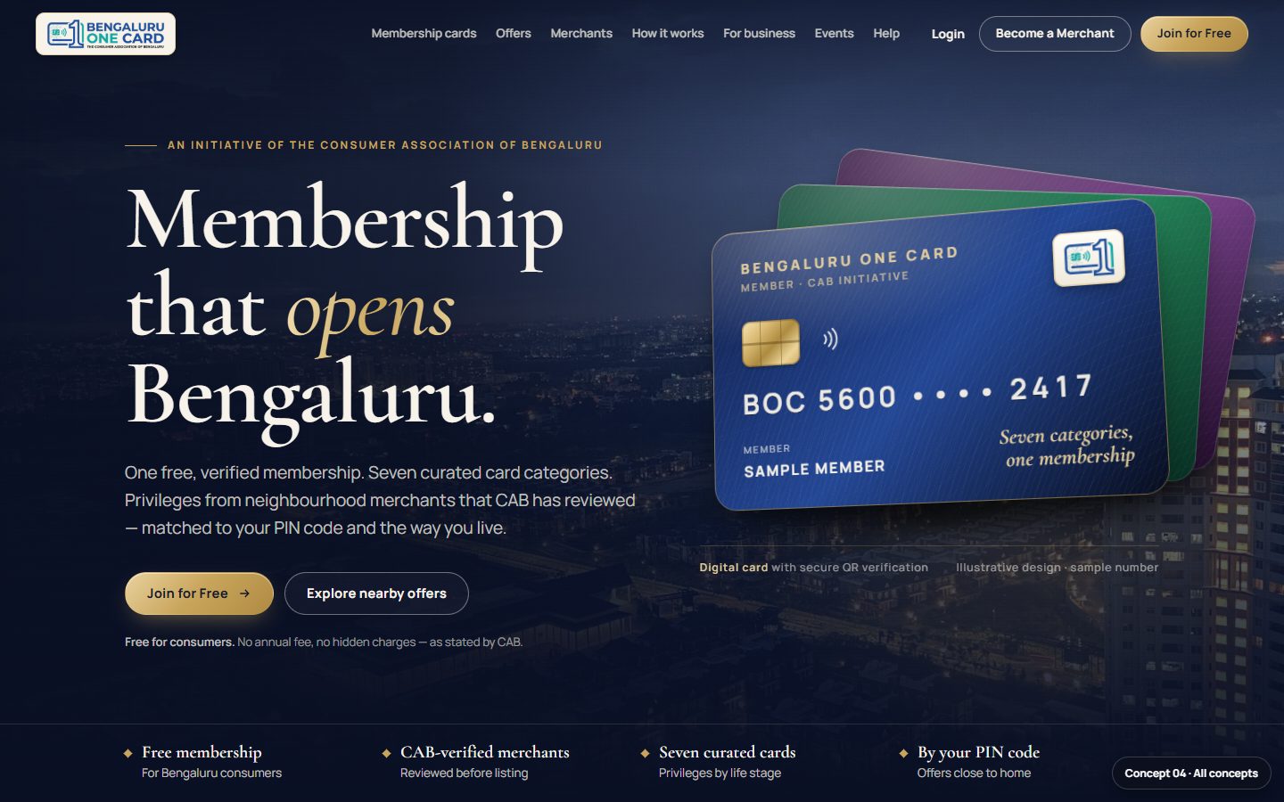
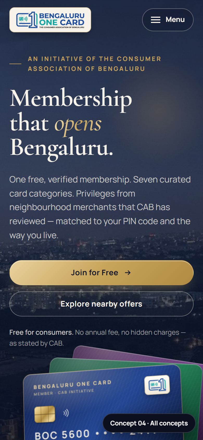
Concept 04 desktop: dark navy hero with the headline Membership that opens Bengaluru and a fan of realistic membership cards over a night city photo.
CONCEPT 04

Premium Membership

Styled like a premium credit-card brand: midnight navy, champagne gold and refined serif type. A realistic card that tilts as you move the mouse, a fanned deck of all seven cards to flip through, privileges in fine photo frames, and a merchant section styled as an invitation.

Typography
Cormorant Garamond (display) · Manrope (text)
Palette
Highlights
3D card tilt, flip-through card deck, ledger-style cash-points
Strengths
  • Makes a free card feel valuable
  • Very distinctive
  • Premium for merchants too
Trade-offs
  • Can feel exclusive for a free, inclusive card
  • Dark sections less suited to long reading
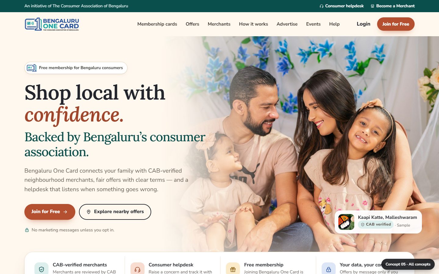
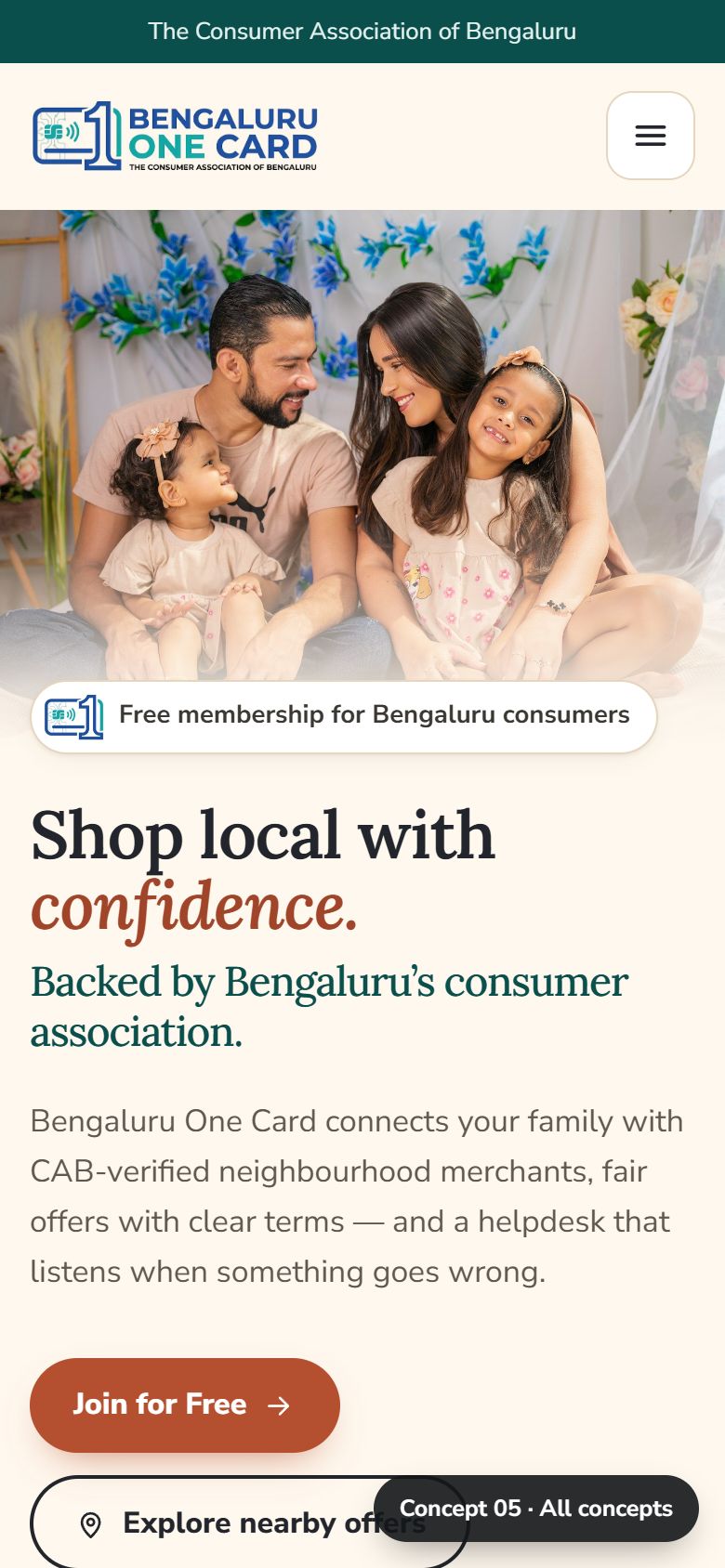
Concept 05 desktop: warm cream hero with the headline Shop local with confidence, backed by Bengaluru's consumer association, beside a family photo.
CONCEPT 05

Community & Trust

Warm and human, with The Consumer Association of Bengaluru's consumer-protection story first. A family hero and a trust strip, then "our promise to members" with a simple complaint journey. Neighbourhood photo tiles, community events and a step-by-step "grow with your neighbourhood" path for merchants.

Typography
Lora (headings) · Nunito Sans (text)
Palette
Highlights
Neighbourhood tiles run the PIN search, event month filter, onboarding stepper
Strengths
  • Strongest credibility for CAB
  • Welcoming for families and seniors
  • Explains complaints support
Trade-offs
  • Less "shopping excitement"
  • Longest page of the five

Round 2 · Concepts 06–10 · all-new photography

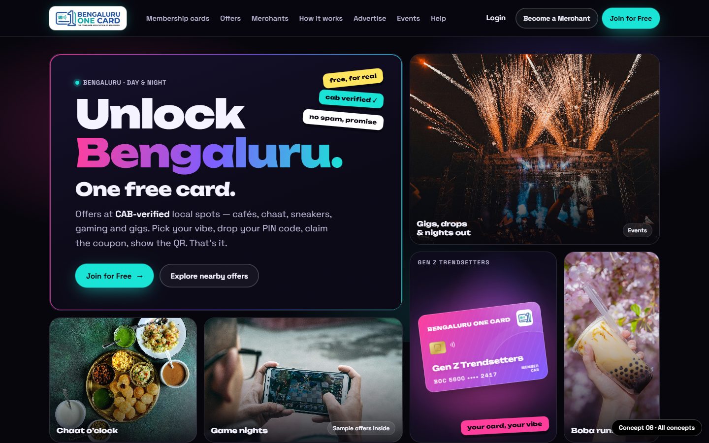
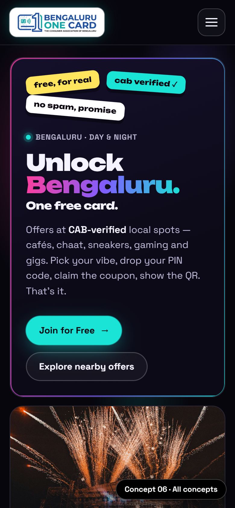
Concept 06 desktop: dark neon bento grid with the headline Unlock Bengaluru, a glowing pink Gen Z card, fireworks, chaat, gaming and bubble tea photos.
CONCEPT 06GEN Z

Neon Night

Bengaluru after dark, for Gen Z. Dark mode with pink, violet and cyan neon, sticker badges and a scrolling ticker. The hero is a bento grid of gigs, chaat, gaming and bubble tea around a glowing Gen Z card. Offers appear as "drops", events as gig posters and testimonials as chat messages.

Typography
Unbounded (display) · Space Grotesk (text)
Palette
Highlights
Bento hero, story-style card rail, drop countdowns, XP-style points bar
Strengths
  • Instantly speaks to young people
  • Very shareable look
  • Great for events and food offers
Trade-offs
  • Less suited to seniors and families
  • Dark theme is a bold brand move
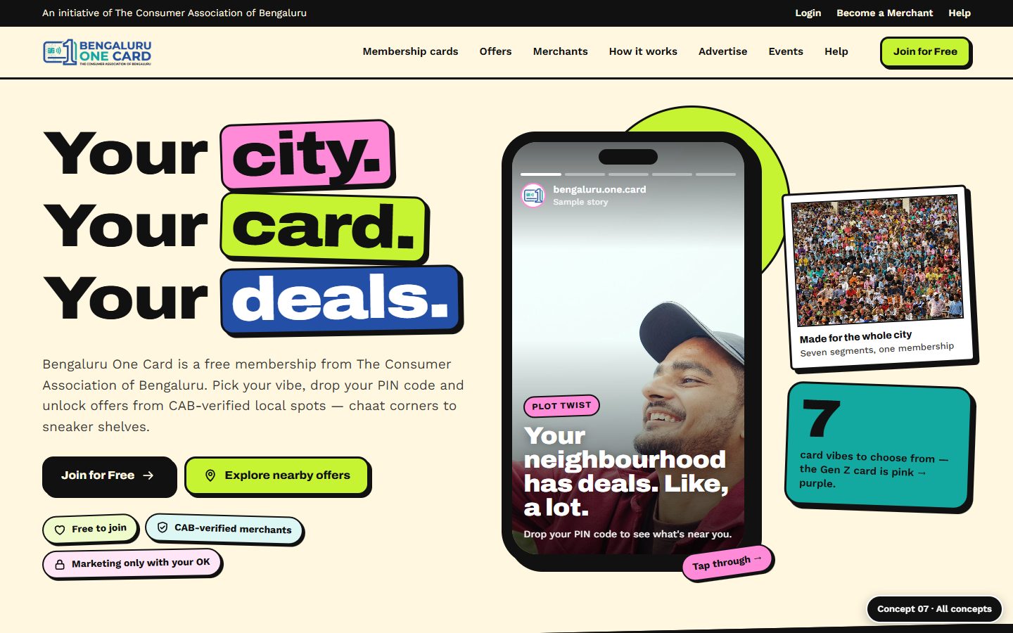
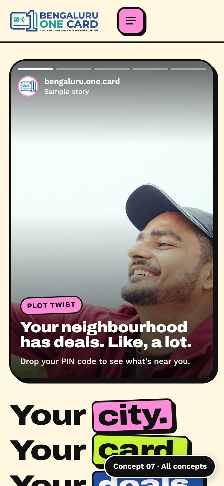
Concept 07 desktop: bright butter-yellow page with the chunky headline Your city. Your card. Your deals. beside a phone showing Instagram-style stories.
CONCEPT 07GEN Z

Pop & Swipe

A bright, playful pop style, like a social app. Thick black outlines, chunky shadows, polaroid photos and flat colour blocks. The hero is a phone of tappable stories, the seven cards are a deck you swipe to "pick your vibe", and a quick this-or-that game suggests a card.

Typography
Archivo Expanded (headlines) · Work Sans (text)
Palette
Highlights
Stories hero, swipe card deck, this-or-that game, ticket-style offers
Strengths
  • Mobile-first and interactive
  • Fun but still clear
  • Light theme is friendly to all ages
Trade-offs
  • Playful tone may feel informal for CAB
  • Long page on phones
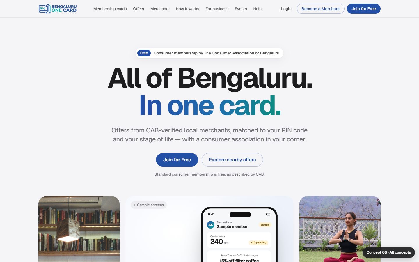
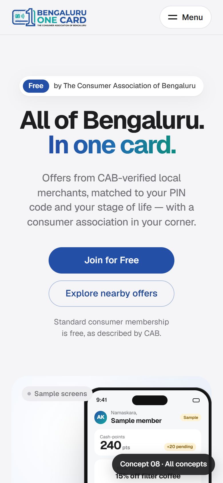
Concept 08 desktop: light grey Apple-style page with the centred headline All of Bengaluru. In one card. above a member-app phone mockup and photo tiles.
CONCEPT 08

Bento Showcase

BOC presented like a beautifully designed product, the way Apple presents an iPhone. A calm grey canvas with white tiles, each explaining one feature: PIN search, the seven cards (switch with a segmented control), CAB verification, cash-points and a merchant dashboard preview.

Typography
Geist · Geist Mono (numbers, PINs)
Palette
Highlights
Member-app mockup, card switcher, merchant dashboard tile
Strengths
  • Most premium and modern
  • Explains features very clearly
  • Easy to build and maintain
Trade-offs
  • Less local Bengaluru flavour
  • Photos play a supporting role
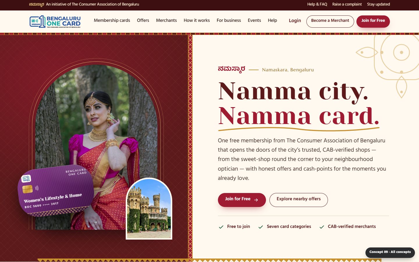
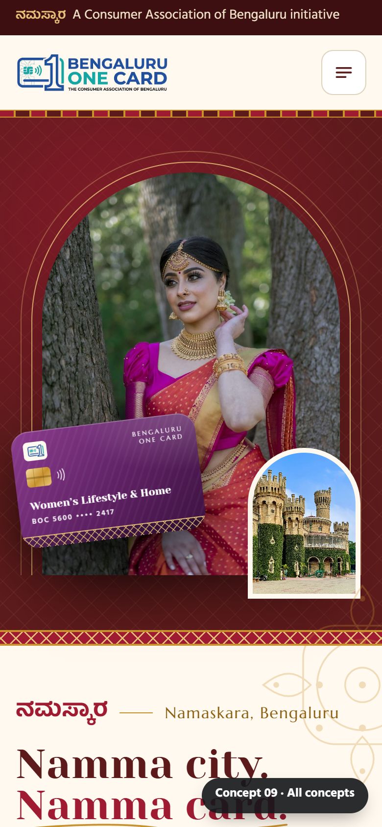
Concept 09 desktop: maroon and ivory split hero with an arch-framed photo of a woman in a silk sari, Bangalore Palace inset and the headline Namma city. Namma card.
CONCEPT 09

Namma Heritage

A celebration of Bengaluru and Karnataka culture, made modern. Mysore-silk maroon, temple gold and leaf green, zari border patterns, arch-shaped photo frames and a Kannada greeting. Bangalore Palace, silk saris, sweet shops and festive rangoli set a proud local tone.

Typography
Yeseva One (display) · Marcellus · Hind Mysuru (supports Kannada)
Palette
Highlights
Arch card tabs, festive offers band, medallion categories
Strengths
  • Strongest local identity
  • Appeals across ages
  • Ready for festive campaigns
Trade-offs
  • Rich decoration needs care to stay fast
  • Less of a "tech" feel
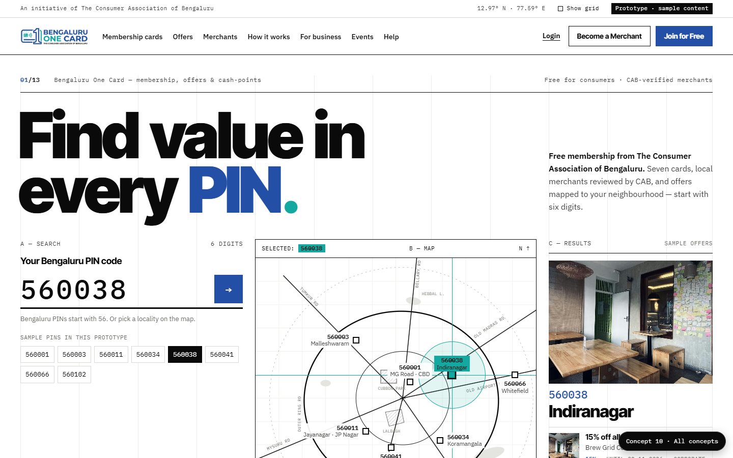
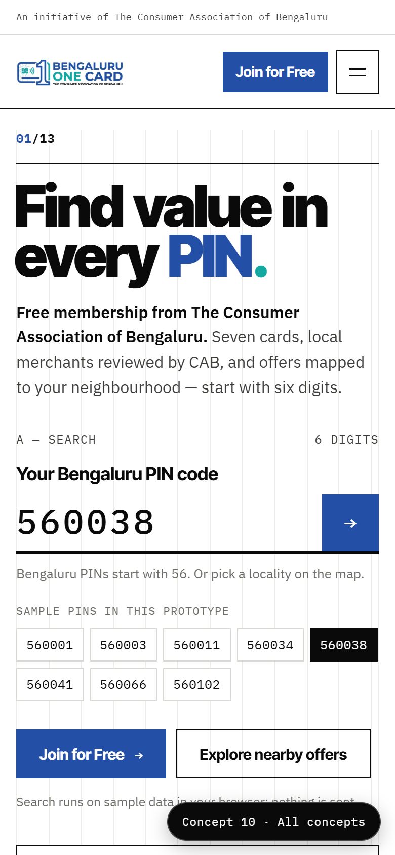
Concept 10 desktop: white Swiss-style grid with the huge headline Find value in every PIN, a large PIN input, a schematic map of Bengaluru localities and sample results.
CONCEPT 10

Swiss Map

Minimal Swiss-style design built around a Bengaluru map. Black and white with one blue, a visible grid and huge type. The hero has a large PIN input beside a schematic map of eight localities: click one to see its sample offers. Photos stay greyscale until you hover over them.

Typography
Inter Tight (display) · IBM Plex Sans · IBM Plex Mono
Palette
Highlights
Clickable locality map, offers table, 7-column card grid
Strengths
  • Makes "hyperlocal" obvious
  • Distinctive, award-style design
  • Very fast to scan
Trade-offs
  • Austere for some audiences
  • The map is schematic and needs real data later

At a glance

ConceptLeads withBest forFeel
01 Cinematic CityFull-screen Bengaluru photo slider + PIN searchStrong first impression, city prideBold, modern, airy
02 Lifestyle MagazinePeople photography and the seven cards as personasExplaining the seven cards clearlyEditorial, elegant
03 Local MarketplaceSearch, categories and offer cardsGetting members to offers fastBright, app-like, practical
04 Premium MembershipThe card itself, privilegesMaking a free card feel valuableLuxurious, dark navy and gold
05 Community & TrustCAB's consumer-protection story, families, eventsCredibility, community, merchant trustWarm, human, reassuring
06 Neon Night · Gen ZBento hero, glowing Gen Z card, nightlifeYoung members, events, food and fashion offersDark, neon, playful
07 Pop & Swipe · Gen ZInstagram-style stories, swipeable card deckYoung members on mobileBright, bold, fun
08 Bento ShowcaseBOC as a product: card, app screens, feature tilesClear explanation of every featureCalm, precise, Apple-like
09 Namma HeritageBengaluru culture, Mysore-silk colours, arch framesLocal pride, festive campaigns, all agesRich, cultural, festive
10 Swiss MapA Bengaluru map and the PIN searchHyperlocal discovery by neighbourhoodMinimal, rigorous, typographic